Below is my work from the unit 1, enjoy...
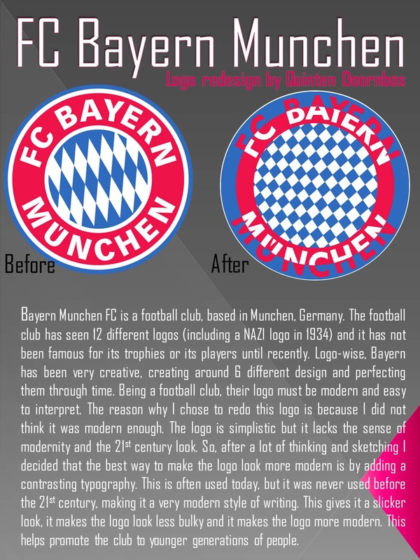
Logo comparison chart

Design Brief and Specification
For my logo, I am going to redesign the logo of the Bayern Munich Football Club. Their logo has been redone 10 times, the latest re-do being in 2002. However, Bayern Munich only started winning their championships in 2009, due to transfer of some really good players. Nowadays, Bayern Munich has won 51 national championships and 11 international championships, most of them earned in the last 5-10 years. The reason why I want to redesign the Bayern Munich logo is because I think it looks aged. We are in a modern era thus the logo should look its part. It should be modern, creative but yet conveying the message that the team Bayern Munich is a modern-era dominating team. Another reason why I want to redo their logo is because does not look too interesting. With a simple diagonally checkered blue-white pattern, the logo looks dull and boring. The returning concepts visible in most Bayern Munich logos are the checked patters, the red band, and the white text saying ‘BAYERN’. This will all be transferred to the next logo only then with a more modern point of view. However, I do not want to rely too much on the colors because this will take away the looks of the logo when it is used in black and white. I also do not want to make my logo complicated. As my teacher says: K.I.S.S (Keep It Simple Stupid Stilly), this will increase the aesthetic features of the logo and make it look more visually appealing.
Design Specification:
1. Colors. My logo will need to have the Bayern Munich Football Club trademark colors. Red, blue and white are the colors of the logo Bayern Munich and these same colors will need to be used in the next logo as well. If these colors are not used, then the fans and supporters of the club might not buy the merchandise or even like the club any more.
2. Circular logo. Another famous trademark that can be seen in all Bayern Munich logos throughout the last century is the fact that the logo is round. This too will need to be in the new Bayern Munich logo or else it will face the wrath of the angry supporter.
3. Typography. The words: ‘Bayern Munich FC’ or ‘Bayern’ have to be on the new logo. They define the logo for whom and what it is. Most modern clubs that use old-school logos do not have a name on it, therefore making the Bayern logo all the more unique.
4. Trade mark checkers. The blue and white checkers originated for the first time in the 1961 logo and have been included ever since. This is something that should not be taken away because it has gained likeness over time and is now an iconic feature to the Bayern Munich logo.
5. White outline. Around every logo that has been made, Bayern Munich has kept a nice but subtle thin white outline to keep everything in the perspective of the viewer. Although this is something that few people realize, without it, the logo would not be the same.
6. ‘Thinner’. The new logo should be thinner. This is something that has never been done before with any of the previous Bayern Munich logos and the reason for this is was that back then it was not needed. Nowadays, many clubs have a simple logo with a much bigger meaning. This means that if the Bayern logo is more, simplistic and thin, more added meaning will be added and people will probably like it more.
7. More modern. The logo should look simple, but yet in such a way that it says: ‘I was made in the 21st century’. This will attract more young supporters because it was made in their time. And because there are many adolescents and young children playing football and playing FIFA, a new, cool and modern logo would not hurt.
BIBLIOGRAPHY:
· "How to Create a Professional Logo." Webdesigner Depot RSS. N.p., n.d. Web. 17 Sept. 2014.
· "10 Common Mistakes In Logo Design - Smashing Magazine." Smashing Magazine. N.p., n.d. Web. 17 Sept. 2014.
· "N.Y. Daily News Disavows ‘Redskins’ — and the Team’s Logo, to Boot."Washington Post. The Washington Post, n.d. Web. 24 Sept. 2014.
· "Branding: Behind Gap's Logo-Change Disaster | News - Advertising Age."Advertising Age News RSS. N.p., n.d. Web. 24 Sept. 2014.
Company Profile
Company Name: FC Bayern Munich
Company CEO Name: Karl Hopfner
Stock Market Price Today: 1.85 Billion USD
Stock Market Price Same Time Last Year: 1.30 Billion USD
1. How would you describe the company services and/or products?
A football team, located in Munchen, Germany. They play football.
2. What are the long term goals of the company?
To win as many championships as they can.
3. When the last time the company’s logo was was redone? Please cut out and paste in your Design Books the old logo.
2002
4. What do you want your new logo to accomplish?
To ‘modernize’ the logo into the 21st century
5. Who are your main competitors?
Dortmund, Schalke 04, FC Barca, Real Madrid, Man Utd., Liverpool, PSG, Ajax
How are you different from your competitors?
We are better and we have the lowest value of all the leading teams, and we are still beating them…
6. What’s the age range of the company’s target customer base?
5 – 70 years old
Project-related questions
7. What is the company’s slogan? Will you use this slogan in the logo?
They do not have a slogan, thus I will not use it.
8. Do you have any specific imagery in mind for your logo?
A more ‘modern’ version of the Bayern logo.
9. Do you have any color preferences, or existing brand colors?
Red, blue and white.
10. Do you have any colors that you do not wish to use
Black, green, yellow, orange.
11. What adjectives should best describe your logo?
Awesome, modern, interesting, creative.
12. What feeling or message do you want your logo to convey to those who view it?
A message that Bayern Munich is a new type of club. Because of its bad history (barely winning any championships), a new logo would perfectly mark a beginning of a ‘winning’ era.
13. How would you like the typography to appear?
Examples: script, bold, light, hand drawn, custom lettering
Bold same lettering as previous typography.
14. Where will you logo be used?
Example: print, web…
Posters, Internet, club website, etc.
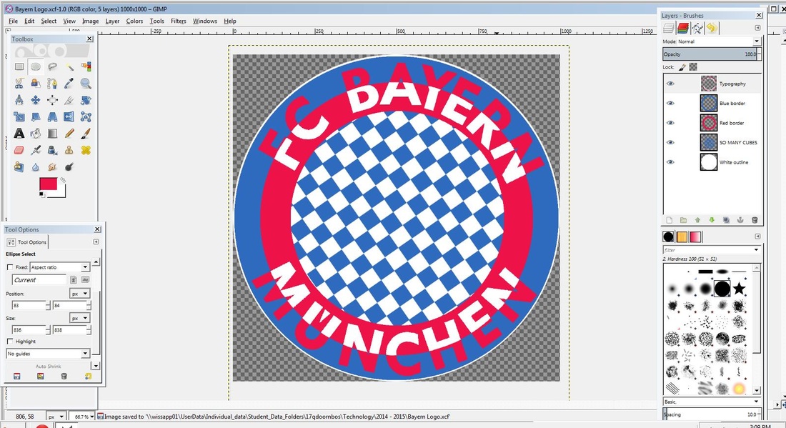
Create: the logo

Before |
After |
Logo poster
Evaluate Stage
For the Investigation stage I made the Logo comparison chart and I researched into each of the different logos surrounding the logo that I want to redo. Enduring this stage, I was very thorough; it was definitely one of my strengths. I researched more that the average amount of logos and gathered a lot of very useful data. This definitely helped me in narrowing down the main points of improvement for my logo and enabled me to make a better logo. The problem that encountered during this process was that I could not find all the specific information about this topic. This was a bit annoying because I had to check several websites for just a single piece of factual information. However, after some time, I managed to find all the correct facts and put them in my logo comparison chart. Next time I think that there are some areas where I could improve to enhance my effectively on the investigation stage. The biggest point of improvement for next time is that I should chose a logo with a lot of information, fact-wise, as this makes my life much easier and allows me to check other sources to see if the information is valid and up to date. With the information for my current logo comparison chart I do not know for sure if all sources are valid and it the facts are up to date.
Process journal
13th November 2014
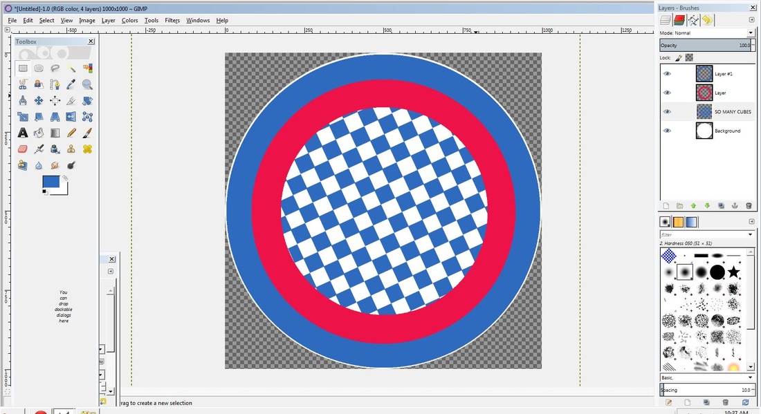
Today I made my basics shapes and my layering shapes. I made a 1000 X 1000 template and made a circle that fit exactly that template. On top of that I layered on 2 additional circles smaller than the original one, in the colors red and blue. This gave me a white outline then a blue layer and the a red layer. After this, I started on the checkers. I was supposed to do the text first but with the time frame, starting the text would not work. For the checkers I first put in the original Bayern checkers from the old logo but the checkers were too big and there was a white outline which I could not remove easily. Then I made a single square in the middle and replicated and duplicated until I filled the whole central area. Then I deleted the spare parts and then colored it in the Bayern colors.
19th November 2014
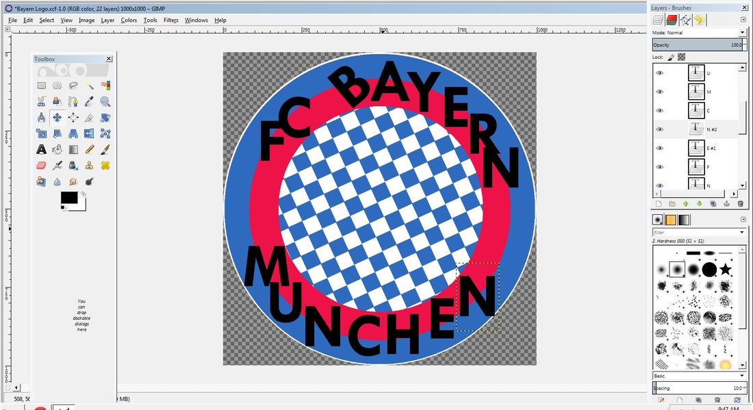
Today I started working on my typography. I inserted all of the letters at a size of 200 so that I would not have many different letter sizes which can confuse me and make the logo more beautiful and aesthetically pleasing. Next time I will position the letters and add the stress on the U in MUNCHEN.
20th November 2014
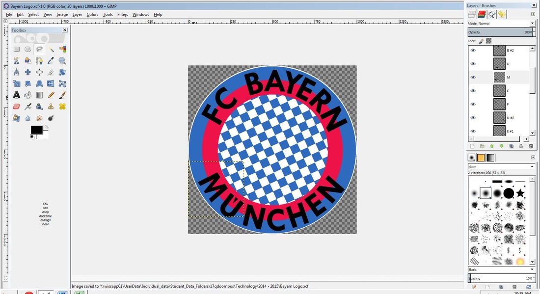
Today I re-positioned the typography in the correct way, circling around the logo, in the borders of the blue and red borders. I also added the stress point on the U in the word MUNCHEN and I made sure that around half of the letter is in each border. This is because then when I add the double color letter coloring it will look better.
26th November 2014
Today I worked on coloring my typography. I encountered a problem, which was that I was not able to color them in their contrasting colors. However, with some creative thinking and Mrs. Stanley’s help, I just selected the letter, colored it white and then drew over it with the second color, only coloring the upper part, creating the contrast. With 101% concentration, I managed to just finish all the letters in time, putting me way ahead of the schedule on my Gantt chart.
27th November 2014
Today I finished my logo. I made the squares more into diamonds and I made some finishing touches to the typography. There was not that much work left to do but some changes were necessary. I also started on my reflection and I am currently working on that.
